
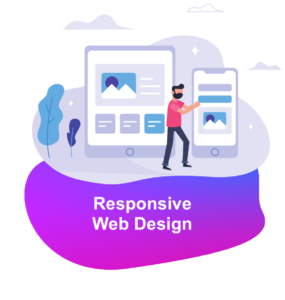
We can help you build a commercially successful, market leading responsive website – we’d love to hear about your project.

- Web Design
- Digital Strategy & Consultancy
- Creative Design
- Digital Branding
- Reputation Management
- Content Copywriting
Web Development- Digital Strategy & Consultancy
- Creative Design
- Digital Branding
- Reputation Management
- Content Copywriting
Content Production- Digital Strategy & Consultancy
- Creative Design
- Digital Branding
- Reputation Management
- Content Copywriting
Web Infrastructure- Digital Strategy & Consultancy
- Creative Design
- Digital Branding
- Reputation Management
- Content Copywriting
- Digital MarketingPerformance Marketing
- Digital Strategy & Consultancy
- Creative Design
- Digital Branding
- Reputation Management
- Content Copywriting
Search & SEO- Digital Strategy & Consultancy
- Creative Design
- Digital Branding
- Reputation Management
- Content Copywriting
Social & Influencer- Digital Strategy & Consultancy
- Creative Design
- Digital Branding
- Reputation Management
- Content Copywriting
Leads & Automation- Digital Strategy & Consultancy
- Creative Design
- Digital Branding
- Reputation Management
- Content Copywriting
- Sectors
- About Us
- Our Works
- Contact